Logos
the essence of the essence
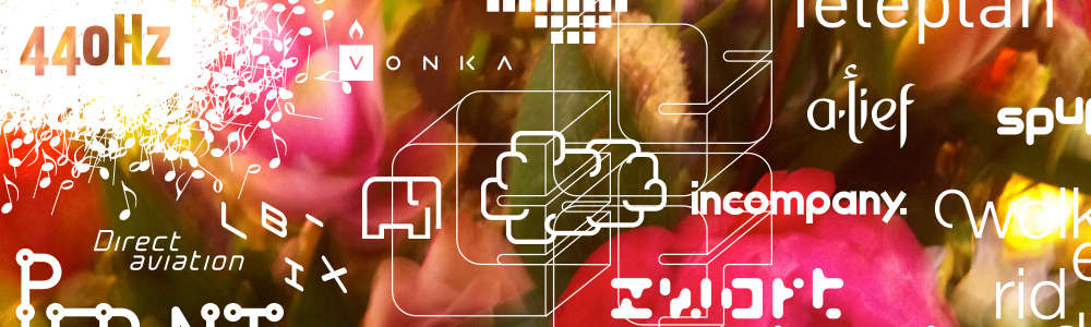
The Logos from C-Roots. A logo is not an organisation, but every organisation needs a logo. A logo is nothing more and certainly nothing less than the visual and (typo) graphic representation of what an organisation essentially is. The impact of purpose and ambition in the most basic form imaginable. Easily recognisable and obvious to identify with. The art of creatively capturing that essence in image, colour and character calls for strategic and creative talent

Want to know more? Take a look at The Logos from C-Roots or order a paperback copy for 20,- euro here

The logos from C-Roots, part 2 is a collection of specials from C-Roots’ past and present. It includes the golden oldie, Himmelblau. There’s even the rejected logo for the Austrian ski resort Lofer, that we still want to include it because it conveys the philosophy behind the ‘roots’ so perfectly.
Take a look at The logo's from C-Roots part 2 or order a paperback copy for 20,- euro here

The logos from C-Roots, part 3. When we create a logo at C-Roots, it’s not the beginning, but the end of a process. During this process it must become clear who you really are as a company or organisation, what you want to be, what you do, why it matters and what makes you unique. Once these questions have been answered, you’ve got the ideal starting point to develop a logo that can work for you. It communicates how you want to be seen and what sets you apart from the competition. But more than anything, it conveys what you’re proud of, what you want to be seen wearing or build on the wall. The logo has become the symbol of corporate identity.
Take a look at The logo's from C-Roots part 3 or order a paperback copy for 20,- euro here
